

 (Credit: CDC)
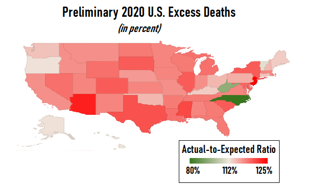
Early government numbers show that at least 3.2 million people died in the United States in 2020, and that the number of deaths was at least 12% higher than expected.
Complete your profile to continue reading and get FREE access to BenefitsPRO, part of your ALM digital membership.
Your access to unlimited BenefitsPRO content isn’t changing.
Once you are an ALM digital member, you’ll receive:
- Critical BenefitsPRO information including cutting edge post-reform success strategies, access to educational webcasts and videos, resources from industry leaders, and informative Newsletters.
- Exclusive discounts on ALM, BenefitsPRO magazine and BenefitsPRO.com events
- Access to other award-winning ALM websites including ThinkAdvisor.com and Law.com
Already have an account? Sign In
© 2024 ALM Global, LLC, All Rights Reserved. Request academic re-use from www.copyright.com. All other uses, submit a request to [email protected]. For more information visit Asset & Logo Licensing.
Allison Bell
Allison Bell, ThinkAdvisor's insurance editor, previously was LifeHealthPro's health insurance editor. She has a bachelor's degree in economics from Washington University in St. Louis and a master's degree in journalism from the Medill School of Journalism at Northwestern University. She can be reached at [email protected] or on Twitter at @Think_Allison.